Brand magic – from the south side of Chicago
Posted: June 7, 2015 Filed under: Art & architecture, Chicago, Design | Tags: Archibald Motley, Chicago Cultural Center, Valmor Products 1 CommentBrand identity is a modern concept, or so it’s said. Companies, profit and nonprofit, and political campaigns devote extravagant amounts of time, money and energy to position themselves consistently—verbally and visually—with their priority audiences.
But almost a century ago, a small but creative company on the south side of Chicago developed its own distinctive brand and visual identity for an array of products designed to help its customers find beauty and romance.
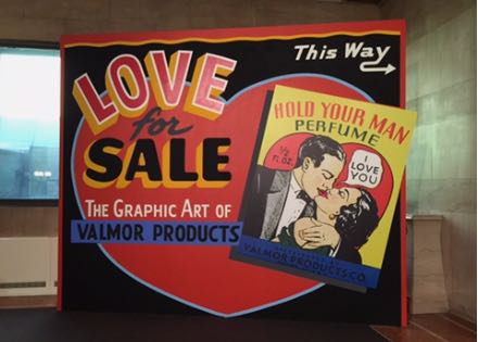 Valmor Products’ advertising and packaging is the subject of a funny, provocative and eye-opening exhibit at the Chicago Cultural Center. Love for Sale: The Graphic Art of Valmor Products runs until August 2 in the 4th floor north exhibit hall, just across from the not-to-be-missed exhibit of the paintings of Archibald Motley: Jazz Age Modernist. See my Motley review for details. (All photos by Nancy Bishop.)
Valmor operated on the near south side (as the location image shows, near the intersection of Cermak Road and Indiana Avenue) from the 1920s through the 1980s. Their products were perfumes, hair pomades and straighteners, incense and a great variety of other products designed to help the individual (male or female) attract and please the opposite sex. Some of the products claimed to have mystical or magical powers.
The Cultural Center’s comprehensive exhibit is the first to show Valmor’s remarkable works of graphic design—product labels, packaging and advertising. Some of the labels were no bigger than a postage stamp, as you can see from the photo of the spilling bin of packages. (Other vintage bottles and containers are also on display.) Those tiny labels were enlarged to poster-size using modern imaging technology. The result is an exuberant display of social and cultural history as well as graphic design.
Charles Dawson, Valmor’s first designer, was a distinguished artist. His life and career are described here by the American Institute of Graphic Arts (AIGA), the professional organization for design. Dawson’s unpublished autobiography is in the DuSable Museum of African American history.
The Chicago Cultural Center, as I’ve noted before, is a Chicago treasure that many people aren’t aware of. It was opened as the city’s central library in 1897, designed by the Boston architectural firm, Shepley, Rutan and Coolidge. They created a number of monumental civic structures in the Romanesque style of Henry Hobson Richardson (best known here as architect of the John Glessner House). In 1977, the building was re-created as a city cultural center. It offers many exhibits of artistic and architectural interest, concerts, films and other performing arts events–and admission is always free.
The Washington Street side has a grand Carrara marble staircase leading to Preston Bradley Hall with its beautifully restored 38-foot Tiffany glass dome. The hall was the library’s main circulation room, which is why the mosaics that line the walls display the names of authors and philosophers. (View the restoration story in the video above.) If you enter on the Randolph Street side, you’ll find a large area with tables and seating, where you can meet with a friend or client, read or do a little work. But be sure to walk up (or take the elevator) to the fourth floor, where you’ll find both the Motley and Valmor exhibits.
September, musical birthdays…and nostalgia
Posted: October 3, 2013 Filed under: Design, Music, People | Tags: Berwyn bungalows, Bruce Springsteen, John Coltrane, Leonard Cohen 7 Comments


September. It was a lovely month. Usually it means no more hot weather…for which I shout hurray. On a Sunday morning walk, I celebrated the charms of North Avenue beach by hanging out for a while at the Chess Pavilion. It’s a beautiful refuge from the sun and my favorite place to take a break on the lakefront. The Chess Pavilion was built in 1957, designed by architect Maurice Webster. Sculptor Boris Gilbertson carved the stone chess pieces and the incised chess figures.

The Man–at 64
Happy birthday, Bruce
September is also the month of Bruce Springsteen’s birthday (the 23rd), which gives me an excuse to post a photo of him looking great at whatever his age is. This year it’s 64. Here’s a photo of him on the beach in Rio de Janeiro, where he played his first South American concerts in many years.
Happy birthday, Leonard
And it’s the month of other important birthdays. Like Leonard Cohen (the 21st), who at 79 is still touring, looking fabulous and sounding like his usual charming, gravel-voiced self. He’s sort of a lounge lizard version of Tom Waits. Leonard is still touring on his latest album, Old Ideas. He’ll be in Australia and New Zealand in November. I reviewed his March concert at the Chicago Theater.
Remembering Trane
And it’s also the month to remember the late great John Coltrane, who shares Bruce’s birthday, September 23. If Trane were alive today, he would be 87. His death at the age of 40 was a tragedy and an immense loss to the music world. He was and is today enormously influential to young musicians. He was beginning to experiment with avant-garde jazz (as in his spiritual album A Love Supreme) as well as with eastern religions.
Trane’s biography and legacy are complex. He’s been treated as a religious figure by some African-American churches; there is at least one film about the St. John Coltrane African Orthodox Church in San Francisco; and a church in New Jersey includes him on a list of African-American saints. You’ll find some beautiful images and a great Coltrane quote on that church page. And they hold services every Sunday with the Coltrane liturgy.
Bungalow nostalgia
My house, a very fine house
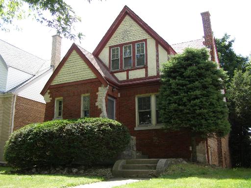
Before going on a Berwyn bungalow tour last week, I was exploring far northwest side real estate to see how bungalows are currently valued. (They are real values, solidly built small houses in pleasant older neighborhoods.) I decided to search for the house where I grew up and was pleased to find a great photo of it from the time of its last sale in 2009. The house is on Rutherford Avenue in the Montclare neighborhood, near the intersection of Grand and Oak Park avenues. My parents bought the house in 1938 and lived there for about 30 years.
The standard bungalows in Berwyn all have similar layouts. Small front hall, living room, dining room, kitchen, half bath and sometimes a small bedroom on the first floor. The second floor typically has sloped ceilings in the two bedrooms plus one full bath. These are small houses, typically 1200-1500 square feet. My parents’ house, even though it didn’t have a bungalow façade, had exactly that inside layout. The developer on that block decided to spiff up the exteriors by applying “Tudor” façades. I could draw the floor plan from memory this minute.
“Super-bungalows,” are larger and have different space layouts, more bedrooms and baths. We saw a few of those in Berwyn Sunday. The tour is a self-guided walking tour to seven or eight houses, with docents stationed at each house to guide visitors through the interiors. It’s an annual event, so put it on your calendar for September 2014. I recommend it highly.
Design at Work and Play
Posted: June 12, 2013 Filed under: Design 1 CommentThe Chicago Design Museum has a varied exhibition on graphic design titled Work at Play, part of the Pop-Up Art Loop project. The exhibit includes work by four major designers and a collective of 12 contemporary designers. You can see it until June 30 in a raw temporary display space on the third floor of the Block 37 building, 108 N State St.

Wall of John Massey posters. Photo by Nancy Bishop.
My review at gapersblock.com notes that the exhibit honors the work of John Massey, a famous Chicago designer best known as the director of design and communications at the late great Container Corporation of America and the founder of the CCA Center for Advanced Research in Design.
Read my review at gapersblock.com.
Newest hot spot? Median on State Street
Posted: June 8, 2013 Filed under: Art & architecture, Design | Tags: Chicago Loop, State Street 1 CommentThe city of Chicago opened a new temporary park called Gateway to the Loop right in the middle of State Street yesterday — on the median between Wacker Drive and Lake Street. It’s a great place to savor your Starbucks, meet a friend for a brown bag lunch, or just kill time being an urban person. It’s really quite charming.
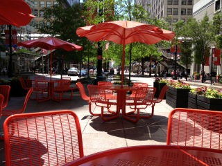

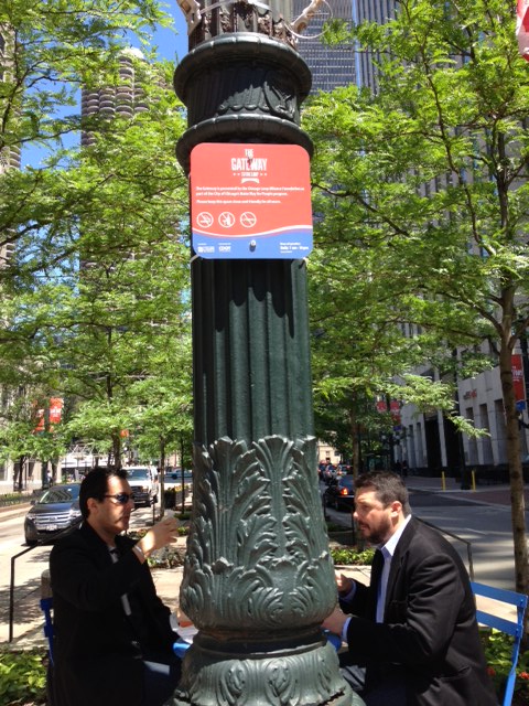
Photo credit: Nancy Bishop
Dumpster dive to floral design
Posted: May 21, 2013 Filed under: Design | Tags: adaptive reuse, mid-century design 1 Comment My grandson James presented me with a very creative Mothers Day gift. He took adaptive reuse to an extreme, creating a contemporary flower arrangement that fits perfectly with my decor. Which is pretty mid-century modern with lots of glass and chrome and a color palette of black, gray, white and a few bright colors.
His raw material? Pieces of heavy gauge copper and aluminum wire that he and his dad found in a dumpster at a construction site. (His father–my son Steve–is a home renovation contractor.)
James stripped off the black insulating shield covering the metal cables. He used a pliers to grab individual metal strands and twist them to make petals. Cables of three different lengths make an interesting arrangement, shown at the left. It’s a very cool addition to my living room.
I thought at first the material was coaxial cable, which is most often used by cable and telephone companies to carry signals from antenna or central locations to customers’ homes or offices. But no, it’s just plain old heavy duty wire, which is used for a variety of building purposes.
You might also be interested in art that other people have created with similar materials, especially the bull sculpture by a homeless man in New York. Several youtube videos here.
I love type
Posted: August 15, 2012 Filed under: Design | Tags: Typography Leave a commentMy lifelong love affair with letterforms
I love visual things. Especially black and white things. Black and white cinema. Forget Technicolor, I’ll take mine noir. Black and white photography. A rich black and white image, maybe even a duotone, where the black-and-white image is enriched with dark brown or blue. And black and white design. Woodcuts. A gray and black Sol Lewitt print.
But most of all, I love type. I love serifs and not serifs, slashes and ampersands. I love a beautiful lower case g or a capital R with a bit of swagger. And so I’m sad at the thought that we may be reading everything online or on an e-book soon because it hinders my appreciation of letterforms. Read the rest of this entry »
