I love type
Posted: August 15, 2012 Filed under: Design | Tags: Typography Leave a commentMy lifelong love affair with letterforms
I love visual things. Especially black and white things. Black and white cinema. Forget Technicolor, I’ll take mine noir. Black and white photography. A rich black and white image, maybe even a duotone, where the black-and-white image is enriched with dark brown or blue. And black and white design. Woodcuts. A gray and black Sol Lewitt print.
But most of all, I love type. I love serifs and not serifs, slashes and ampersands. I love a beautiful lower case g or a capital R with a bit of swagger. And so I’m sad at the thought that we may be reading everything online or on an e-book soon because it hinders my appreciation of letterforms.
My love for type is tactile. Not just visual. My first connection with type was at my father’s print shop. He owned a small letterpress job shop in what Chicagoans now call the West Loop. (It was just off Skid Row then.) He added offset presses when they became available but it was basically a metal shop. I worked there summers during high school and college. The printing forms were usually metal trays with lines or individual metal letters (yes, Grasshopper, individual pieces of metal!) locked in a form. When my dad needed a lot of type, he would order it from a nearby typesetting house, which would set it on a Linotype machine. But for things like menus and order forms, his bread and butter work, the type was set by two gentlemanly old compositors who worked from California job cases.
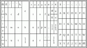
Each letter, numeral and symbol had its own cube in the case; letters used most often were in lsrger cubes. Originally, the capital letters and symbols were in an upper case and small letters in a lower case – thus, they are called lower case. The compositors would pluck letters out and line them up in a metal stick.
After my many requests, one of them – named Andy — finally agreed to show me how to set type – so I would get to practice while they were on their lunch breaks. The type was solid and heavy and the letterforms were mirror-image, of course. (Thus I’ve never had any trouble reading papers upside down on people’s desks.)
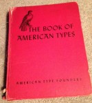
One of my treasured possessions is my father’s “red book”: The Book of American Type published by American Type Founders, copyright 1941. The book is 8.5×11, hard cover and bound in red, although the spine has come off and it’s a bit shabby looking. The
red book shows display sizes and full alphabets of everything from Bodoni (eight versions) to Cloister Black and Wedding Script. My father’s favorite font was Cheltenham and he strongly disapproved of what he saw as the haphazard creation of new fonts that the new offset printing technology allowed. (Type design became much more casual when it was released from the strictures of metal starting in the 1950s and ‘60s.) My father thought that Chelt, Caslon, Century and News Gothic ought to be enough for anyone.
(A designer I worked with named his dog — a chubby black Labrador — Cooper, which only a type geek would appreciate as the name of a classic type face.)
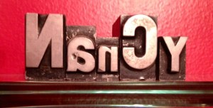
My son and his wife retrieved a set of metal type souvenirs spelling out my first name on one of their antique hunts. The N and C are 72 pt bold sans serif caps. The other letters are smaller and lower case.
My second tactile experience was in college. With trays of Linotype. At the University of Missouri School of Journalism, Friday afternoon was a special time for the copyediting class. We would go down to the pressroom and “cut copy.” We took trays of type from the Linotype machines, inked them and pulled galley proofs, which were then sent to the copy desk. The next step was for those trays of metal type to be used to create a newspaper page. Sort of like cutting and pasting paper, except with heavy metal.
Over the next 30 years of working in publishing, PR and marketing, my love for type survived many revolutions.
After years as a newspaper reporter and time out for kids, I got a job with a university publications office that published course catalogs. The university’s catalogs, then set in metal type that languished all year in a printer’s storage space until time for a new edition, were converted to 16-track computer tape. We edited on an IBM 360/67 terminal, using an early word-processing program called WYLBUR. Automated pagination by a vendor made the catalogs ready for printing.
There was an interim step using an IBM MT/ST typesetter that involved pasting up paper galleys – I have tried to block that from my mind.
During a job as a speechwriter for a large consumer services company, I was thrilled to switch from writing on a typewriter to writing on a Wang word processor. A few years after that, the first Macintosh arrived on the assembly line – and I was waiting at the end to grab the first one produced. (Well, almost.)
After many years of using PCs while working for large corporations and having a matching PC at home for convenience – I rebelled. I became a Mac girl again and have remained one ever since.
Now I love type as I write and format notes and documents as I please on my MacBook and my iPad. I know that seems basic to people under 40 – or maybe 50. But it’s an immense revolution since those metal type days … which weren’t so long ago. Oh and I can also play with type on my iPhone. And my Kindle.
I love letterforms wherever they are. Incised in stone or metal. Etched on glass. In books, newspapers, magazines, billboards, album or CD covers or business cards. In digital form on screens of all sizes and shapes.
I love type.

