Brand magic – from the south side of Chicago
Posted: June 7, 2015 Filed under: Art & architecture, Chicago, Design | Tags: Archibald Motley, Chicago Cultural Center, Valmor Products 1 CommentBrand identity is a modern concept, or so it’s said. Companies, profit and nonprofit, and political campaigns devote extravagant amounts of time, money and energy to position themselves consistently—verbally and visually—with their priority audiences.
But almost a century ago, a small but creative company on the south side of Chicago developed its own distinctive brand and visual identity for an array of products designed to help its customers find beauty and romance.
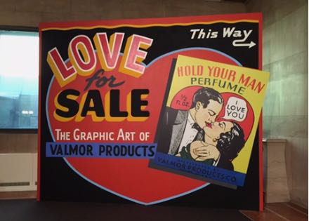 Valmor Products’ advertising and packaging is the subject of a funny, provocative and eye-opening exhibit at the Chicago Cultural Center. Love for Sale: The Graphic Art of Valmor Products runs until August 2 in the 4th floor north exhibit hall, just across from the not-to-be-missed exhibit of the paintings of Archibald Motley: Jazz Age Modernist. See my Motley review for details. (All photos by Nancy Bishop.)
Valmor operated on the near south side (as the location image shows, near the intersection of Cermak Road and Indiana Avenue) from the 1920s through the 1980s. Their products were perfumes, hair pomades and straighteners, incense and a great variety of other products designed to help the individual (male or female) attract and please the opposite sex. Some of the products claimed to have mystical or magical powers.
The Cultural Center’s comprehensive exhibit is the first to show Valmor’s remarkable works of graphic design—product labels, packaging and advertising. Some of the labels were no bigger than a postage stamp, as you can see from the photo of the spilling bin of packages. (Other vintage bottles and containers are also on display.) Those tiny labels were enlarged to poster-size using modern imaging technology. The result is an exuberant display of social and cultural history as well as graphic design.
Charles Dawson, Valmor’s first designer, was a distinguished artist. His life and career are described here by the American Institute of Graphic Arts (AIGA), the professional organization for design. Dawson’s unpublished autobiography is in the DuSable Museum of African American history.
The Chicago Cultural Center, as I’ve noted before, is a Chicago treasure that many people aren’t aware of. It was opened as the city’s central library in 1897, designed by the Boston architectural firm, Shepley, Rutan and Coolidge. They created a number of monumental civic structures in the Romanesque style of Henry Hobson Richardson (best known here as architect of the John Glessner House). In 1977, the building was re-created as a city cultural center. It offers many exhibits of artistic and architectural interest, concerts, films and other performing arts events–and admission is always free.
The Washington Street side has a grand Carrara marble staircase leading to Preston Bradley Hall with its beautifully restored 38-foot Tiffany glass dome. The hall was the library’s main circulation room, which is why the mosaics that line the walls display the names of authors and philosophers. (View the restoration story in the video above.) If you enter on the Randolph Street side, you’ll find a large area with tables and seating, where you can meet with a friend or client, read or do a little work. But be sure to walk up (or take the elevator) to the fourth floor, where you’ll find both the Motley and Valmor exhibits.
Art you don’t want to miss: Archibald Motley, Jazz Age Modernist
Posted: April 22, 2015 Filed under: Art & architecture | Tags: Archibald Motley, Chicago Cultural Center 2 CommentsThe Chicago Cultural Center at 78 E. Washington St. is an under-appreciated gem of our city. The building is home to many interesting and often spectacular exhibits and events. Like concerts under the beautifully restored dome of Preston Bradley Hall. Art exhibits in the Sidney Yates Gallery and in smaller galleries around the building. There’s a comfortable seating area with tables in case you need a spot to rest or get some work done on the Randolph Street side of the building. Too bad the coffee bar is gone, but you can bring your own coffee in.

Motley, Blues, 1929
Right now the Sidney Yates Gallery is home to a fabulous exhibit of the art of Archibald Motley Jr., an African-American artist who studied painting at the School of the Art Institute from 1914 to 1918, whose work was exhibited all over the world and who won many honors. He lived in Paris for a time and traveled widely but he always called Chicago home.
The exhibit–Archibald Motley, Jazz Age Modernist—is here through August 31, then it moves to the Whitney Museum of American Art in New York, opening October 2. That will be the new Whitney, which opens next month. (The new building in the meatpacking district at 99 Gansevoort St. replaces the Marcel Breuer-designed building on the Upper East Side at 75th and Madison. (The Metropolitan Museum will take over the old Whitney, which is good news for preservationists. Some people don’t like the Brutalist-style Breuer building, but I do.)
The exhibit at the Cultural Center is informative and well-organized and includes a substantial section on Motley’s early work. He’s best known for colorful urban scenes but his early portraits (like the one titled Mulatress with Figurine) are insightful glimpses into African-American life of the time. You’ll see portraits of his grandmother and of his wife, Edith Granzo. Motley was born in New Orleans in 1891 and his family moved to Chicago in 1894. He grew up in Englewood, then a German/Irish/Swedish neighborhood, but his social life and artistic inspiration was in Bronzeville. You’ll find exhibits on Motley, his life, thoughts and art in the corridor leading into the Yates gallery.
See my review in Gapers Block for more descriptions of the exhibit and of Motley’s work.
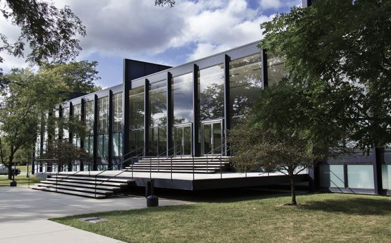
The Mecca: Where modernism began (and memories of Mies)
Posted: April 16, 2014 Filed under: Art & architecture | Tags: Chicago Cultural Center, IIT Crown Hall, Mecca Flat Blues, Mies van der Rohe, the Bauhaus, Thomas Dyja 1 CommentThe first time I heard of the Mecca, the grand old apartment building in Bronzeville, was when I read Thomas Dyja’s colorful cultural history, The Third Coast: When Chicago Built the American Dream. (The book won the 2013 Heartland Prize for nonfiction.) The current exhibit at the Chicago Cultural Center—Mecca Flat Blues—tells the story of the Mecca and how that very site became the location of the campus of Illinois Institute of Technology and of Ludwig Mies van der Rohe’s masterpiece, S R Crown Hall. I just reviewed the exhibit for Gapers Block. You can read my article here.
Photo by Nancy Bishop.
The Mecca was located on 34th and State streets. Amazing stories swirled around the Mecca itself from its opening in 1892 until its demolition in 1952. Dyja gave a lecture last week on “The Battle for the Mecca” and described how that one square block on 34th Street between State and Dearborn streets inspired so much. Gwendolyn Brooks’ great poem “In the Mecca,” was about the time she spent working there. A blues song from the 1920s, “Mecca Flat Blues,” commemorated the building, which was part of an entertainment district where jazz and blues flourished. When you check out my review, be sure to play the video of the blues song with audio from the original vinyl recording, played on a very old turntable. The Mecca was demolished and the site scraped clean to provide the site for the new IIT building. Dyja called it a palimpsest: a writing surface scraped clean for new writing on which traces of past writing remain.
The exhibit continues in the Sidney Yates Gallery at the Cultural Center until May 25. See details at the end of my review.
A note about my Gapers Block article: Chicago Magazine named it one of the “must-read articles of the week.” I was kinda pleased.
Memories of Mies
S R Crown Hall. Photo courtesy Wikimedia Commons
My first visit to Crown Hall was an unforgettable experience for a longtime devotee of architecture and design. It was September 1969 and a major retrospective celebrating 50 years of Bauhaus art and design was on display at Crown Hall. Mies van der Rohe, its architect, was one of the many alumni of the Bauhaus who came to Chicago in the 1930s. Mies had died just the month before—in August 1969. I was living in DeKalb at the time and had never been to the IIT campus, even though I had grown up in Chicago—on the far northwest side. But I was a lover of Bauhaus design and the exhibit was something I could not miss. I started early, so I could spend a whole long day at the exhibit. I had seen small photos of Crown Hall so I knew the building I was looking for on the unfamiliar campus. But as I walked toward it, it took my breath away. The expanse of glass gleaming in the sun and the precision of the steel i-beams were simply stunning. Even though other Mies high-rise buildings are also considered masterpieces, this four-story academic building is much more elegant, because its entirety can be appreciated in one view.
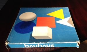
Original catalog from 1969. Photo by Nancy Bishop.
The Bauhaus exhibit was very comprehensive and thrilling to see. Paintings, photography, architectural renderings and photographs, furniture, sculpture, pottery, typography by dozens of famous artists and designers. I was on sensory overload by the end of the day. I still have the square 365-page catalog, which I count among my treasures.
See the Farnsworth House
Another beautiful example of Mies’ low-rise designs is his Farnsworth House in Plano, Illinois—a museum house that’s open for tours April through November.
Related posts
Walking the Mies staircase at the Arts Club. Scroll down in my October post.
Chicago’s Bauhaus legacy. See my comments on the great 2013 exhibit at the Ukrainian Institute of Modern Art.
Speaking of art: The work is what it is
Posted: April 11, 2014 Filed under: Art & architecture | Tags: Art Institute of Chicago, Chicago Cultural Center, Christopher Wool, Finding Vivian Maier 3 CommentsSome musings on the nature of art and the artist…and letting the artist’s work stand on its own.
Finding Vivian Maier—and viewing her work
Yesterday I saw the new documentary about photographer Vivian Maier: Finding Vivian Maier, directed by John Maloof and Charlie Siskel. Maloof is one of the three major owners of Maier’s work and probably holds the greatest number of images (negatives and undeveloped film) and her ephemera. I’ve written about Maier before and her work has had lots of attention in the last two years.
The new film was interesting and well done (although Maloof, who is not a film director, inserted way too much of himself in the film). In deciphering the mystery of Vivian Maier, the filmmakers did some good research, including going to Europe, where she had traveled. They also sought out the now-adult children for whom she cared as a nanny in the Chicago suburbs 50 or 60 years ago. Some of them discussed “Vivian” at length and told stories of her cruelty; others talked about her strange habits and her hoarding.
You know what? I didn’t want to know those things about Vivian Maier because I want to appreciate her work for what it is. Brilliant, engaging images of humanity. The fact that her work was never shown when she was alive is a sad story and in fact, she might not even approve of the current Maier-mania.
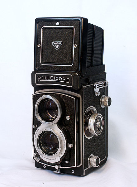
A Rolleicord: My first real camera
But the work is there and it’s magnificent. If you haven’t seen it, get to the Chicago History Museum or check it out online. The work stands on its own.
A technology aside
Maier shot with a Rolleiflex, a twin-lens reflex camera (my first camera, a college graduation present from my parents, was a Rolleicord, the amateur-photographer model) and that meant she could be more discreet in photographing subjects. With a twin-lens, you hold the camera at chest-level and frame the image by looking down into the viewfinder; you don’t hold the camera up to your face, which may seem more intrusive to the subject.
The art is what it is
Today I went to the Art Institute because I didn’t want to miss the retrospective of Christopher Wool’s work. (More below.) It is fascinating, beautiful and interesting as it has changed over time. I don’t want to know if the artist was going through a bad divorce or drinking too much or living in exile. The work is the work. It stands on its own.
You may be thinking of Woody Allen about now. Some of you may believe that he is a perverted, child-abusing horrible person. And he may be. The evidence about that is confusing and contradictory.
But even if he is all those things, his work is still outstanding. He’s one of the finest American film creators of our time. His work deserves to be viewed on its own merits. His art is what it is.
The abstract expressionism of Christopher Wool
The retrospective of Christopher Wool’s work is on display at the Art Institute of Chicago until May 11. It’s in Regenstein Hall in the American modern art wing (not in the new Modern Wing). His early work is probably best known. He used letterforms to create word paintings, using language as image. (All photos by Nancy Bishop.)
One of the best-known works of this period is Apocalypse Now, which Christie’s sold at auction in November for many millions. See an interesting discussion of this sale here. My favorite wall in the current exhibit is Untitled (Black Book Drawings), a series of 22 pieces in which negative character types of eight or nine letters are primly stacked.
In the 21st century, his paintings take on a new expressionistic look in abstract forms of tangles of black lines, shadows, dots and swashes of paint and ink.
His gray paintings in the last rooms of the exhibit are large-scale works in enamel on linen.
Finally or firstly, the bronze Wool sculpture at the entry to the exhibit transforms his two-dimensional creativity into three dimensions. My photo shows the sculpture with the works of Ellsworth Kelly peeping out behind the tangle of metal.
On the horizon
The exhibit titled Mecca Flat Blues at the Cultural Center is not to be missed. I’m writing a feature about it for Gapers Block and will post a link here soon.
Also at the Cultural Center, the exhibit 35 Years of Public Art is just one of many reasons to stop by the building that used to be the Chicago Public Library. It’s a city treasure for many reasons.
